


The average person in the UK spends 90% of their life indoors Taking this into account, as well as societal increased recognition in mental health; it would seem completely crazy (!!!) if we didn’t consider what impact building interiors have on our mental health. This is one of the reasons I’m drawn to bold, colourful interior design. Our homes and everyday spaces are not just backdrops; they can affect our mood, energy, creativity and sense of identity.
Whilst an important aspect of mental health is our own internal thoughts and feelings, a lot of what shapes how people navigate the day is their exterior world. These external factors include personal interactions, the weather, and increasingly social media. However, an often overlooked area (and one of the largest external factors) is the environment in which people exist. And as stated above, this is primarily inside buildings. i.e. interiors. And as such; properly shaping/organising these indoor spaces can have a huge effect (positively or negatively) on a person’s mental health.
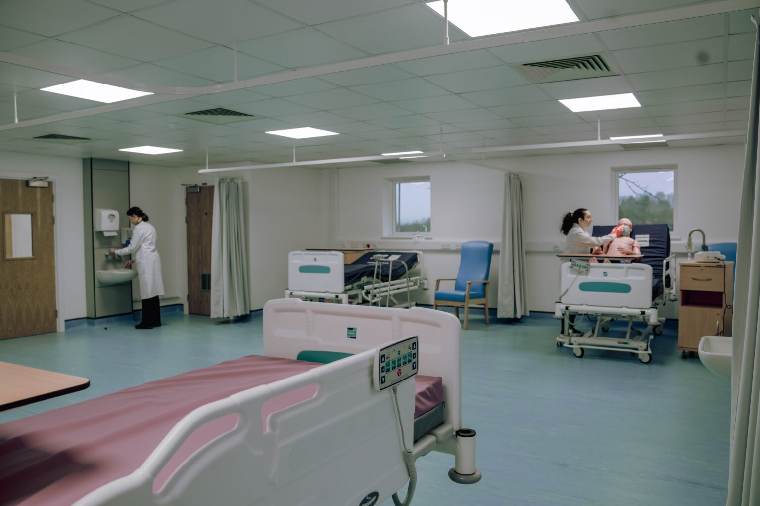
As a former mental health nurse, this is something I’ve often thought to be the case. I’ve worked in a lot of wards, hospitals and care homes. Both general and mental health. And they are mostly grim, ugly and bleak looking places. I have felt for the patients at being stuck in these depressing and dull spaces, often for months on end. And yes, I know NHS money is hard to come by, so they have bigger fish to fry. But would it be so difficult to just get different coloured paint? I digress. Its something I’ve always suspected, but there have been relatively few studies done on the subject matter. Which seems ridiculous. But I would say that as a qualified nurse/interior designer!
Here are some of the key areas that I have managed to find solid evidence on….
Several elements of interior design have been associated with improved mental health, a few of which seem to come up consistently; The effects of sunlight, spaciousness, plants & natural elements, colour and artwork have been extensively studied When used correctly, each of these design elements can create an environment conducive to reducing stress, anxiety, and depression.
Research in psychology and neuroscience shows that our home environment affects the way we think, feel, and behave. According to Dr. Joel Frank, a licensed clinical psychologist; “a well-designed environment can help us relax and restore, but it can also sharpen our minds, enhance our creativity, and put us in a good mood. Even things as basic as not having enough daylight and fresh air can affect our mood and energy levels in the short term and our health in the long term.”
As already mentioned (and as you would expect) colour has a huge impact on our mental health. Lets first take a look at some of the colours that seem to be common for both peoples homes, and many business premises.
Grey, white and beige: All have dominated interior design for years. They are often chosen because they create a sense of calm, simplicity and neutrality. Grey can feel balanced and sophisticated, white can create a sense of space and cleanliness, while beige is often used to reduce visual stimulation and create a relaxing environment.
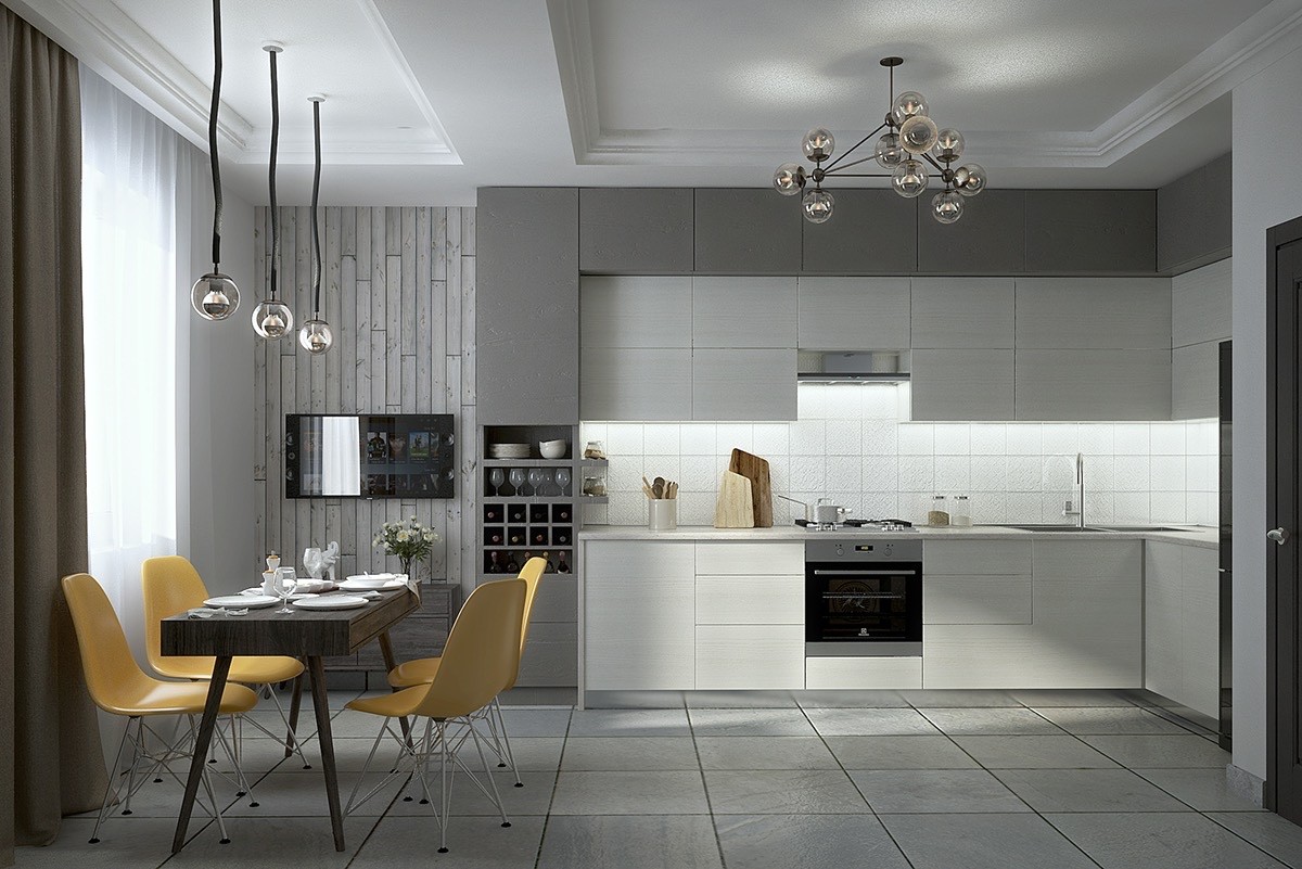
The problem comes when people go all in. Leading authority on Behavioural Colour & Design Psychology Karen Haller, argues that grey can evoke feelings of withdrawal and isolation: "It evokes a lack of confidence, fear of exposure, hiding. In the home surrounding yourself with grey is like cocooning yourself from the outside world, going into hibernation. Over time this can be energy-draining and straining."
Haller suggests many people choose grey in an attempt to create a calm environment, but often end up going too far and creating a space that feels emotionally draining. White and beige can suffer from similar problems. While they can create a sense of calm and order, they can also become sterile, monotonous and unstimulating when not balanced with other colours, textures and points of interest. In studies involving children and adolescents grey was associated with higher levels of internalising problems. i.e. anxiety.
Green: Thanks to its obvious connection with nature, green is often associated with calmness, wellbeing and improved focus. (Although many hospital walls are painted an awful mint green, and I never found work particularly calming. Maybe a stronger dose?)
Conversely colours like orange and yellow can bring psychological benefits such as increased energy , increased warmth, happiness, creativity and that magic feeling everyone seems to be chasing: relaxation (yellow only).
So why do we use these colours so little? One obvious question that comes to mind is this: we wouldn't decorate a baby's, toddler's or child's room entirely in shades of grey, beige or white. We instinctively understand that young minds benefit from stimulation, creativity, playfulness and visual interest. We fill children's rooms with colour, bright pictures, toys and objects designed to spark curiosity and imagination.
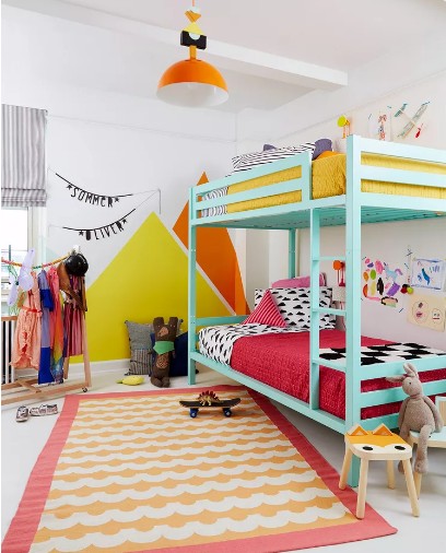
Yet somewhere along the way, many of us seem to decide that adulthood should be the exact opposite. We replace colour with neutrality, personality with restraint and playfulness with "good taste". We spend huge amounts of money creating homes that look calm in photographs but often feel emotionally flat in reality.
Of course, I'm not suggesting every adult should live in a child's bedroom. But perhaps there is something to be learned from the way we design spaces for children. We recognise that our surroundings shape how we feel, think and behave. Why would that suddenly stop being true the moment we" grow up"?
Maybe the aim shouldn't be creating homes that impress estate agents or look good on Instagram. Maybe it should be creating homes that make us smile, inspire our creativity and genuinely improve our daily lives. After all, if colour, creativity and visual stimulation are considered beneficial for developing minds, perhaps they still have something to offer the adult versions of those minds too.
Another interesting trend is the move away from the sharp lines and hard edges that dominated minimalism during the first half of this century. Increasingly, designers are embracing curves, arches and softer forms.
Emerging research suggests humans may have an innate preference for curved shapes over sharp angles, finding them more comfortable and less threatening. Perhaps that's one reason why rounded furniture, arched doorways and softer silhouettes are beginning to appear everywhere, from boutique hotels to our own living rooms.
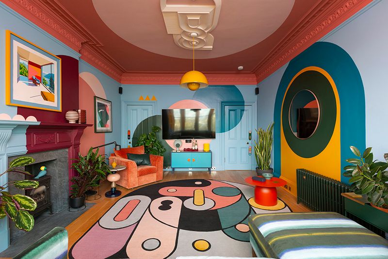
More recently we've seen the rise of "Dopamine Decor" a design movement that prioritises joy over restraint. Bright colours, personal collections, bold patterns and playful objects are all encouraged. Critics sometimes dismiss it as chaotic, but its popularity suggests many people are tired of living in spaces that look more like investment portfolios than homes. Whether you call it dopamine Decor, colourful interiors, maximalism or simply refusing to live in a joyless grey box, the underlying idea is similar: spaces can support how we feel.
The trend appears to have gained momentum during Covid, when many people began prioritising joy and personality over restraint in the spaces they spent so much time in. Psychologist Dr Natasha Sharma suggests this may be because vivid colours can provide small dopamine hits, helping to create feelings of optimism and reward. She also argues that dopamine decor allows people to externalise their identity and boost their mood, contributing to a heightened sense of wellbeing. Interestingly, she notes that homes dominated by grey and neutral tones can sometimes result in feelings of emotional flatness.
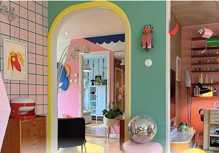
The popularity of programmes like Interior Design Masters and Scotland's Home of the Year isn't driven by viewers wanting to see another magnolia living room. The homes people remember are usually the ones with personality, colour, stories and individuality. With home owners/contestants featured generally going for louder, happy, bright and less ‘traditional’ schemes.
For years we've been sold the idea that the ideal home is calm, neutral and understated. But maybe we've confused "calm" with "bland". Looking at the growing popularity of colourful homes, dopamine decor and personality-filled spaces, it seems many people are beginning to crave something different.
I'm not suggesting every room should look like a kids tv set. But perhaps the evidence points towards something surprisingly simple: homes that stimulate us, energise us, reflect us and bring us joy, might actually be better for our wellbeing than homes designed solely to offend nobody. And too often we’ve settled for interiors that do none of those things.
If we accept that our surroundings influence how we feel, then maybe creating a home that makes you smile every time you walk through the door isn't a luxury at all. Maybe it's one of the healthiest things you can do. And for Acid House Designs, that’s the interesting bit: creating interiors with enough colour, personality and visual interest to actually make people feel something.